JioMart is an ecommerce web and mobile app with 30 million users and 1000+ sellers, was part of the team which took a grocery-only app to an app that sells fashion, electronics and lifestyle products.


My Role
Spearheaded design and strategy for the homepage, full checkout funnel, and support
Collaborated closely with product, engineering, marketing, and legal teams
Scaled design system, component tokenization, and handoff workflows.
Empathizing with the user
Decoding 72% Abandonment Rate: Window Shopping vs. Broken Trust
72% of users abandoned their carts. To understand why we were not converting into transactions, we analyzed user motivations and mapped competitor gaps, discovering that the drop-off wasn't a functional failure, but a trust deficit.


Insights
Users perceived the app as only grocery selling app
While our existing grocery users were trusting us (the app was a grocery app before) the new categories were not easy to explore
No visibility of coupons, leading to missed savings or lack of delight.
Overwhelming when cart contains 20+ items because of no clarity on offers, savings and varying delivery range
Scaling a checkout funnel for 30M users triggers inevitable internal debate.
Cognitive load vs. transparency.
Stakeholders feared that introducing upfront cost breakdowns and category-specific timelines would clutter a once-simple grocery UI. Our design team countered that this exact data was critical to building user trust for high-value purchases like electronics and fashion.
Instead of letting subjective opinions dictate the product roadmap, we launched a high-volume A/B test to let real user behavior make the final call.
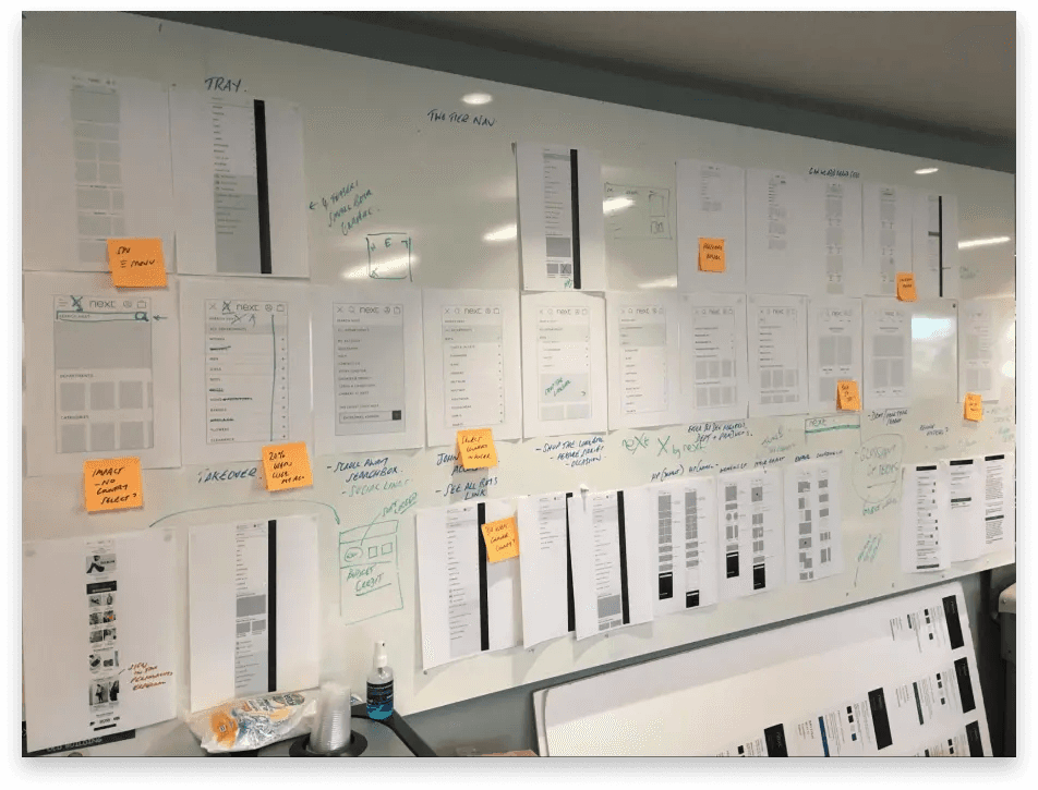
Final design
Homepage redesign strategy
Analytics revealed that the hamburger menu was severely underutilized, yet the search bar was the highest-traffic element on the entire homepage. By hiding new verticals like fashion and electronics inside a conventional side menu, we were actively preventing grocery shoppers from realizing JioMart had expanded.
Personalisation
Offers and suggestions based on last search or purchase history is something that is the set market standard. Leveraging user behaviour/Zipcode early deliveries info can help make instant decisions
Collaborating with Marketing
User Attention Span: Decreases on downward spiral, so limited scroll works better. We found out that infinite scrolls on carousels were trigger points of disinterest for the user.
Easy Categorisation
First-time shoppers are now met with a clean preview of categories right below the primary input field.


Marketing teams need agility to run fast-moving campaigns, but unstructured assets can quickly derail user attention and compromise platform visual hierarchy. Leveraging my background in graphic design, I approached this problem with unique empathy: I knew that a system too rigid would suffocate creative expression, while a system too loose would fracture the user experience.
Instead of building restrictive layouts, I designed an ecosystem of structured flexibility.
Final Designs
Cart Page


Final Designs
Order Review


Key Performance Metrics
Outcome: Measuring Success

Insight
Change led impact
Increased Basket Size: With personalized upselling and a clearer product presentation, users added more items to their cart.
Higher Conversion Rate: The smoother, more intuitive checkout process resulted in fewer abandoned carts.
Improved Customer Satisfaction: Feedback from users, showed that the redesigned checkout was both efficient and emotionally engaging.