Parmonic is an app that transforms long videos with the help of transcripts into digestible chunks called 'Moments'.
My role focused on research, analysing data, and improving the app’s usability.
The primary business requirement was to make the tool more intuitive, eliminating the need for the team to handhold clients during onboarding.
And we achieved it and How↓
Parmonic
Atlanta, US
2022
Feb -July
SKILLS
Cross country team work
System Design
Analysing User Patterns
Usability tests


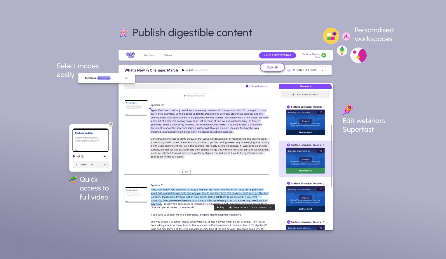
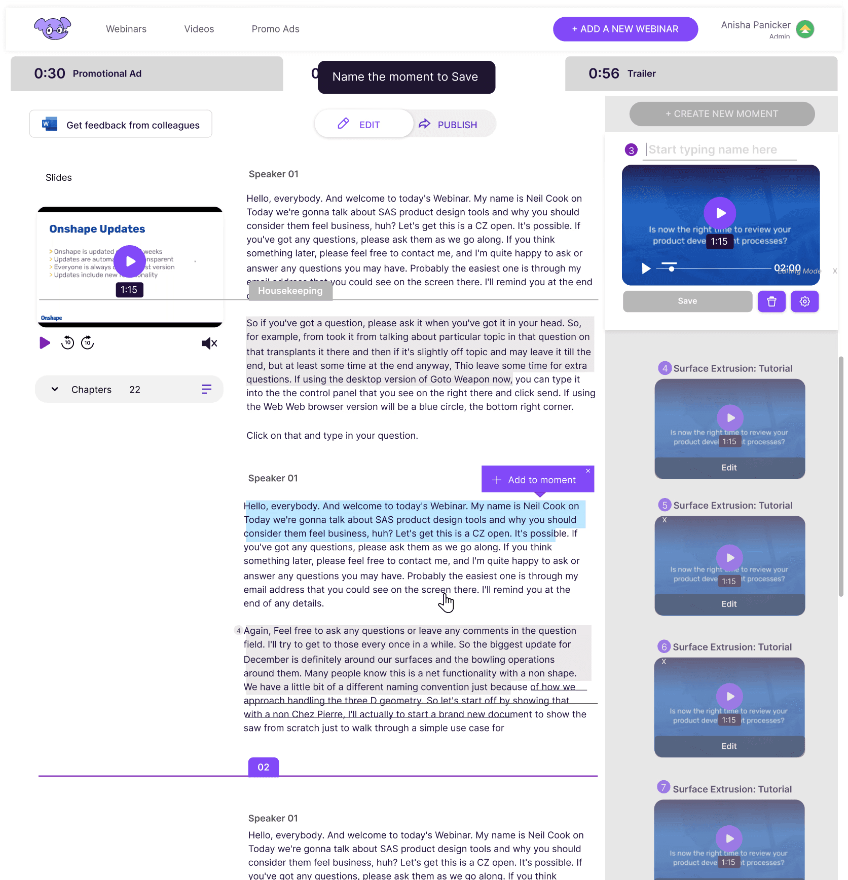
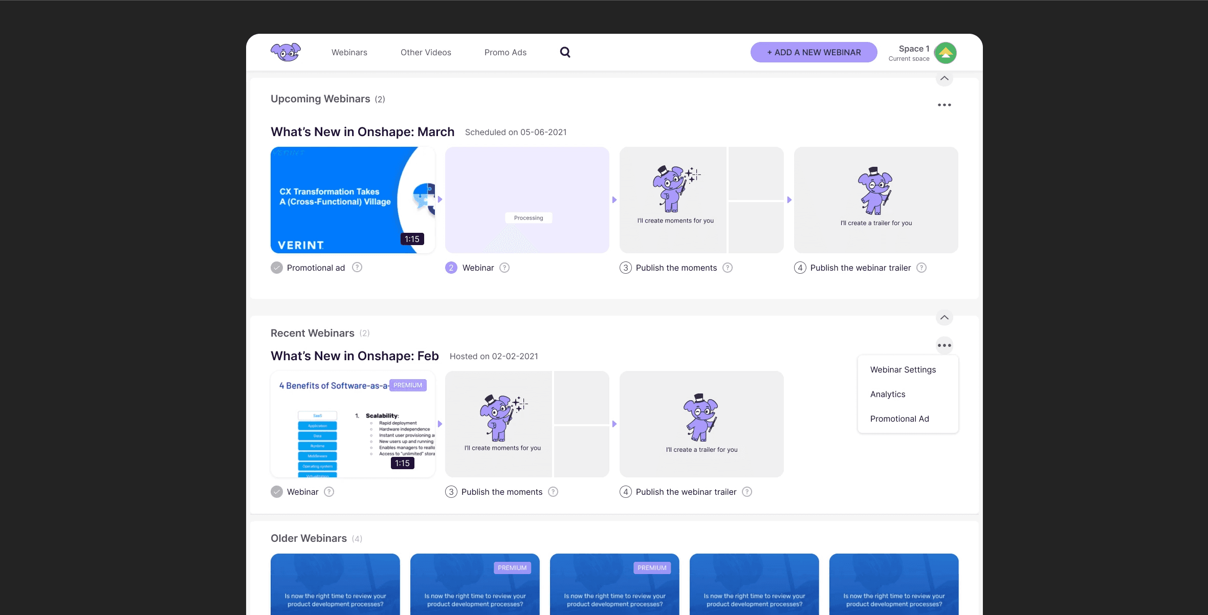
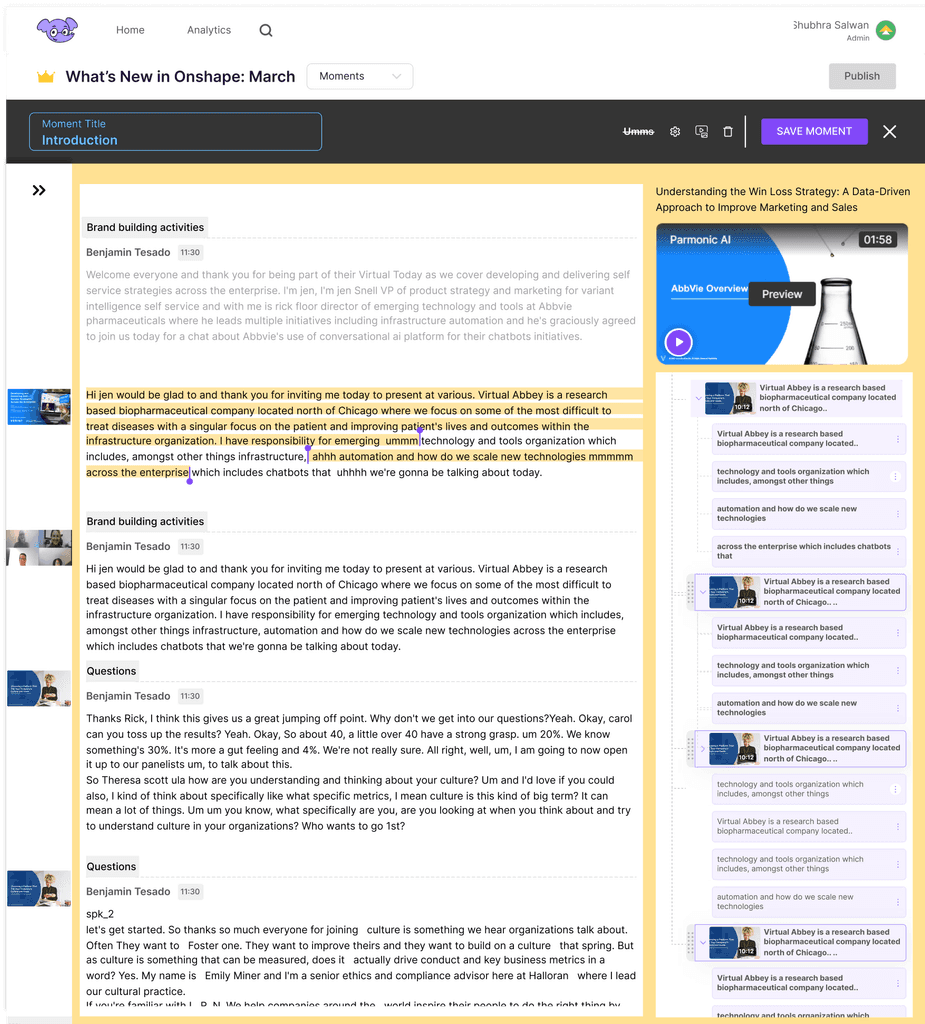
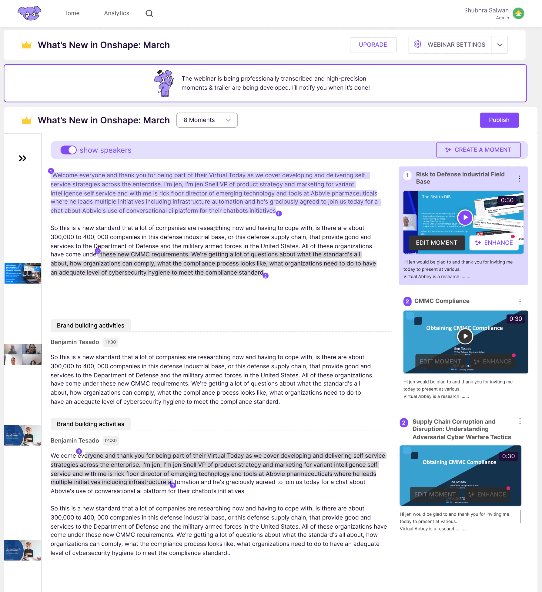
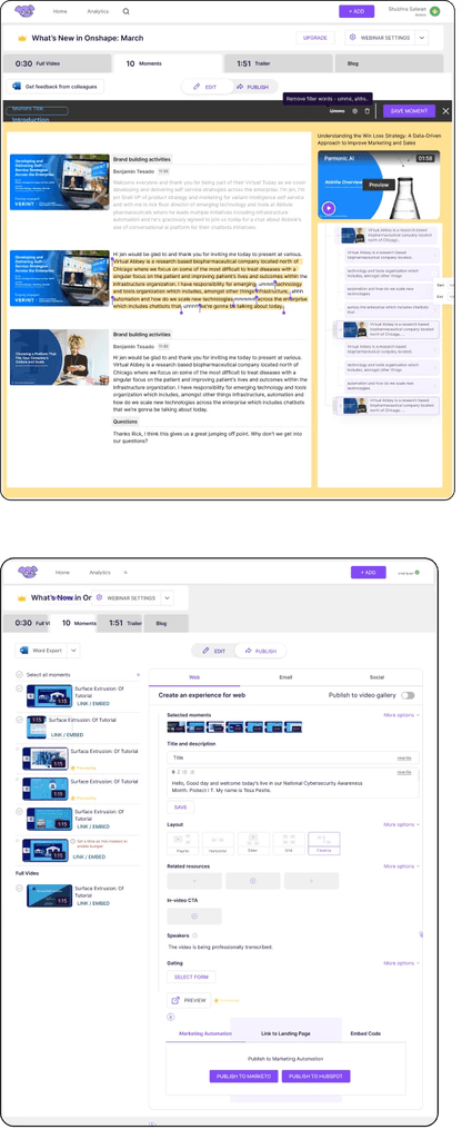
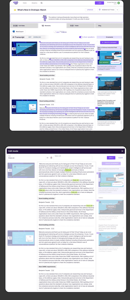
The Moment Editor allowed users to review AI-suggested highlights extracted from long-form video content.
Research Goals
• Understand how users interact with the Moment Editor and identify usability issues.
• What are the other tools they might have to use to edit their videos.
• Ensure the tool meets the needs of the primary user personas (marketers, content creators, etc.).
Business Goals
Eliminate onboarding process
Design the moment editor for making personalised editing on the AI generated moments.
Less inbound requests for help
“We should not drastically change existing layout - it will affect our already existing user base”
Compete with upcoming AI editors
Design the moment editor for making personalised editing on the AI generated moments.
Design Process
Seeing through the user's eyes
Full Story
Figjam
Survey Monkey
Existing User Journey
Primary Personas: B2B Marketing professionals, content creators, and webinar hosts.
Criteria for Participants:
Users who edit webinars regularly.
A mix of experienced users and new users unfamiliar with the Moment Editor.
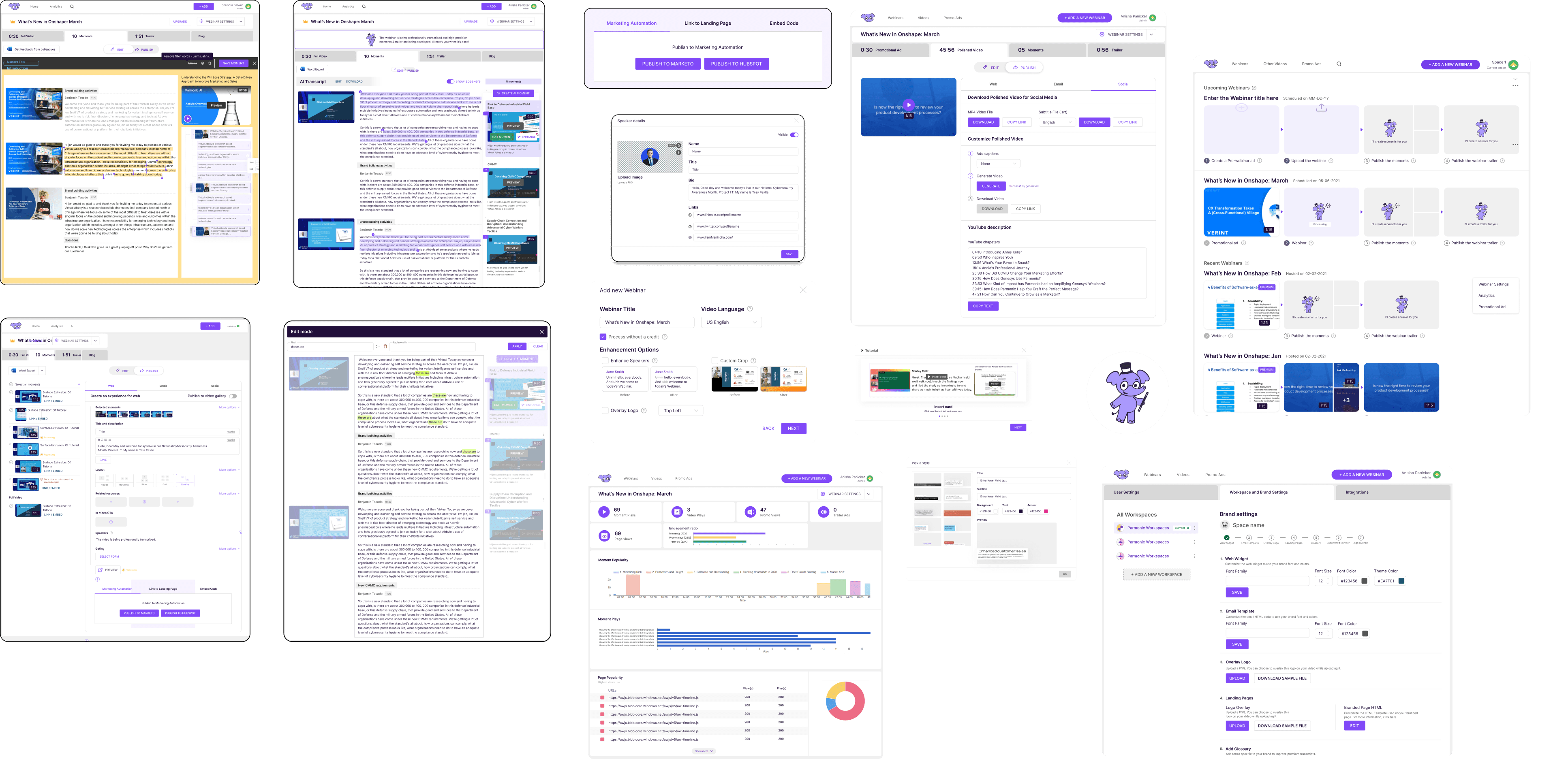
Users journey to publish
Create a Promo AD
Upload a webinar
Detect Slides/Camera
Manual Curation
Publish flow
Premium AI edit
Transcribe Process
Chapterise content
Initial Findings
The backend relied on AI models to segment and score key moments, but the editor interface needs to make these predictions understandable, editable, and trustworthy for non-technical users.
Users interact with a timeline-based UI that surfaced suggested “moments,” but the lack of contextual clarity and editing precision led to confusion and frequent rework. Core friction points included:
Non-linear navigation: Users struggled to trace AI-suggested clips back to the original long-form context.
Editing ambiguity: Overlapping timestamps and unclear hierarchy made it hard to edit or reorder clips.
Feedback disconnect: There is no intuitive way to provide feedback on AI performance, reducing user trust in the system.
Survey Statistics
78% of users were more comfortable using Microsoft Office tools (PowerPoint, Excel) for webinar preparation and post-editing, compared to other tools like Google Suite or Slack.
of webinars edited through the Moment Editor were designed for social media promotion and external distribution. Other major category is to internal information sharing and knowledge distribution within teams.
of users checked that it took them 2-3 videos to learn the tool. Which was when there was no handholding by our onboarding team.
85% of users appreciated the ability to scan selected text from webinars, which helped them quickly find relevant information.
88% of respondents valued the tool's ability to automatically remove filler words (e.g., "uh," "like") from webinars, helping them streamline content for external use.
Initial Discovery Interviews

Sarah
How do i start selecting text to add in the moment
The tap on and tap off does not work for me sometimes:/
Mani
@BeingMani97
Moments are only aligned with the selection , which makes me loose context on the last video content

Dann
I want to see the whole video and want the flexibility to edit the video while watching the webinar

Farah
Seems like one of the speakers fumbled, can i correct the content on transcript

Fekry
I can’t keep track of the number of moments added
Define
Insights and Design
A deep understanding of the problem was the first step
Design Goals
Contextual/Relatable
Intuitive
Effortless
Create a Promo AD
Upload a webinar
Detect Slides/Camera
Manual Curation
Publish flow
Premium AI edit
Transcribe Process
Chapterise content
Brainstorming session
We usually map out a user flow and then edit it according to the features to be added and vice-versa
Highlighted features
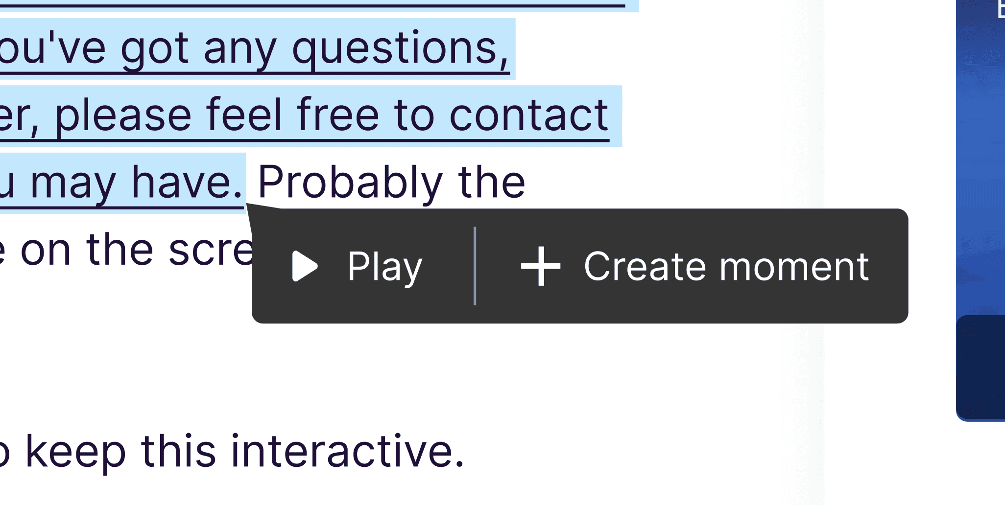
Action on selection - Fitts’s Law
Added ability to make teams and share progress of projects
During resarch we found out users were sharing account details to edit same webinar.


Home page- Clear CTA
Have a currently editing webinar with steps
End to End Experience - Usability, Delight and Coherence.
Posting and managing are enhanced with seperate experience for premium members designed 50+ screens
Create Value Proposition
Clear information on homepage and while onboarding and their visual representation on clients page
Visibility
• Scroll to the particular moment when clicked on sleected text
• Clear CTA to publish , once the user is in publish mode he can always come back.
• The snippets of the webinar for context as in the previous designs are truncated when not needed
Ease
• While editing one moment, there will be just one thumbnail hence avoiding confusion
• Less open options in the top nav
• AI automated title gets generated beased on the context
• Thumbnail is a commonly used setting so kept on the tool bar at the top.
Usability testing
Understanding the why behind actions - Moderated

Karen
User
Clear indicators if the edit mode is adding the moment or creating one and how to enter and exit and clear CTAs
Miachel
User
I liked the quick view of the images in chunks , as the screen changed , it gave me context
Galdin
Product
Our design should encourage the people to make selection and create or add to existing moment
Revamping overall experience
An overview
Final design screens
While the main focus was on the editing screen, the overall experience—from the homepage to publishing—was key to making the design more intuitive.
Impact
We mapped the metrics to understand how users are responding to the new change
Positive response from users
Net Promoter Score (NPS) improved by 25%, rising from 45 to 70, and overall qualitative feedback increased.
Bounce Rates decreased

Bounce rate of users decreased and Average Time decreased in the client onboarding process since the implementation of the Parmonic Editor tool. This includes reductions in the time it takes to set up accounts, create content, or troubleshoot issues.
Handholding during Onboarding eliminated
Specifically, the tool's efficiency in streamlining the client onboarding process resulted in a notable decrease in outsourcing expenses. This translated into a tangible saving equivalent to the employment costs of four customer care resources.